Client: Randed.
Platform: Desktop, Tablet, Mobile.
Project duration: 18 months.
Methodology: 2 or 3-week sprints. Daily status meetings (always with reps from frontend, backend, QA, Marketing and Design departments), planning, reviews…
Software tools: Sketch, Adobe Illustrator, Adobe Photoshop, Axure, Jira, Marvel, Principle, InVision, Visual Studio Code, Google Forms, Google Analytics…
The Challenge
The aim of this project is to offer a new way of surfing the Internet within a secure and controlled environment. This secure environment can be accessed from any device, regardless of the operating system used. This disruptive technology makes known antiviruses obsolete.
Regarding User Experience, one of the main goals was to make the learning curve smooth by maintaining a clear and effective design.
Squad
- Two Product Managers
- One UX/UI Designer
- Two Marketing experts
- Four backend and frontend devs
- Four QA experts
My Role
I led the UX design and contributed in many areas such as ideation, benchmarking, research, user journey, wireframing, information architecture, prototyping, final design, responsive layout (HTML, CSS/Sass, Bootstrap, etc.), style guidelines, heuristics, user testing…
Outcomes
For this particular project, I do not have any showable metrics.
Results
Why wait any longer? In this particular case, I will show you the results first (so I can better engage your attention :D). The handling and configuration of this software improved significantly its usability after my redesign. I created a basic functional UI Kit that served as the basis for creating this and other company tools. All new data-driven designs set the direction in terms of user experience and usability.
The Process
This whole project was created under agile methodology. Below are a series of materials to better understand the process that I carried out with a team of about 13 people, from frontend to backend, to QA or marketing profiles.
01. Software Installer & Admin Dashboard
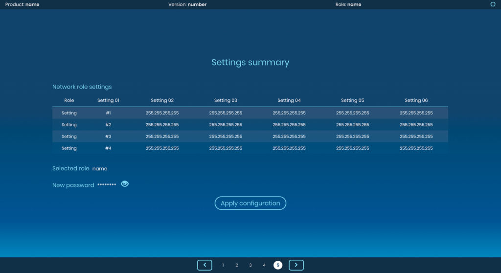
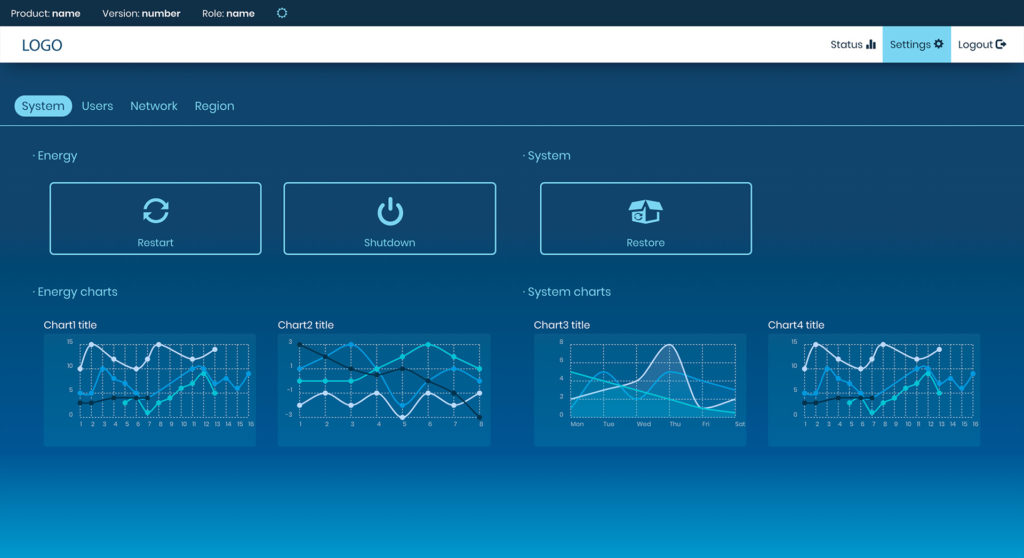
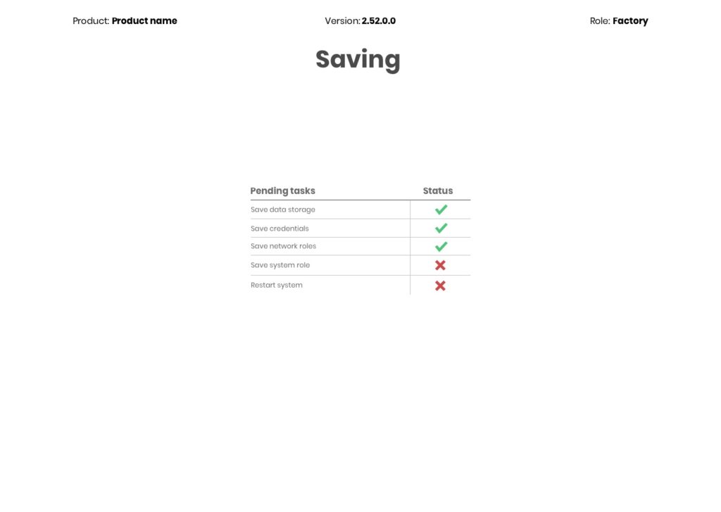
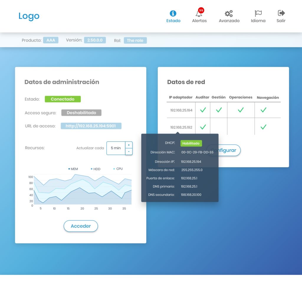
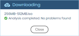
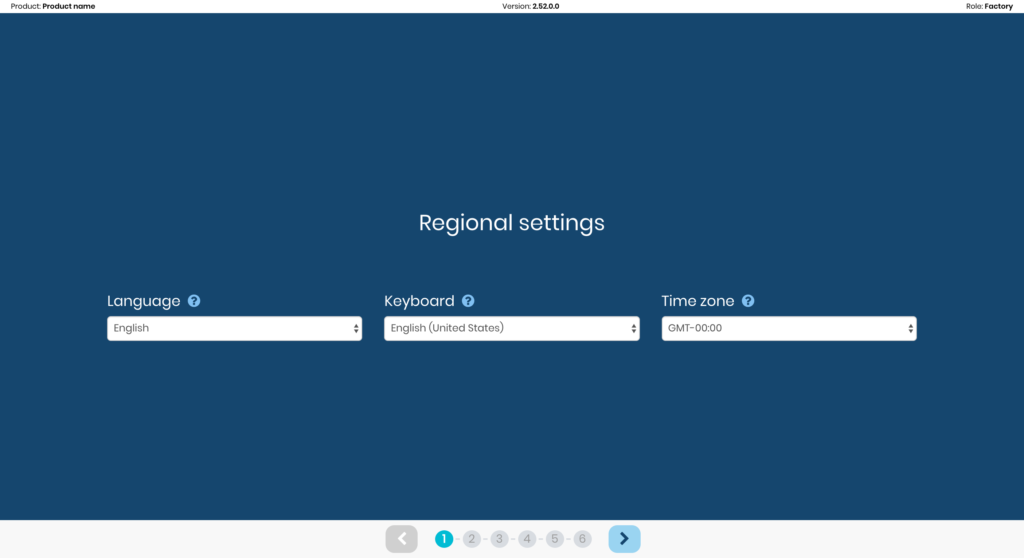
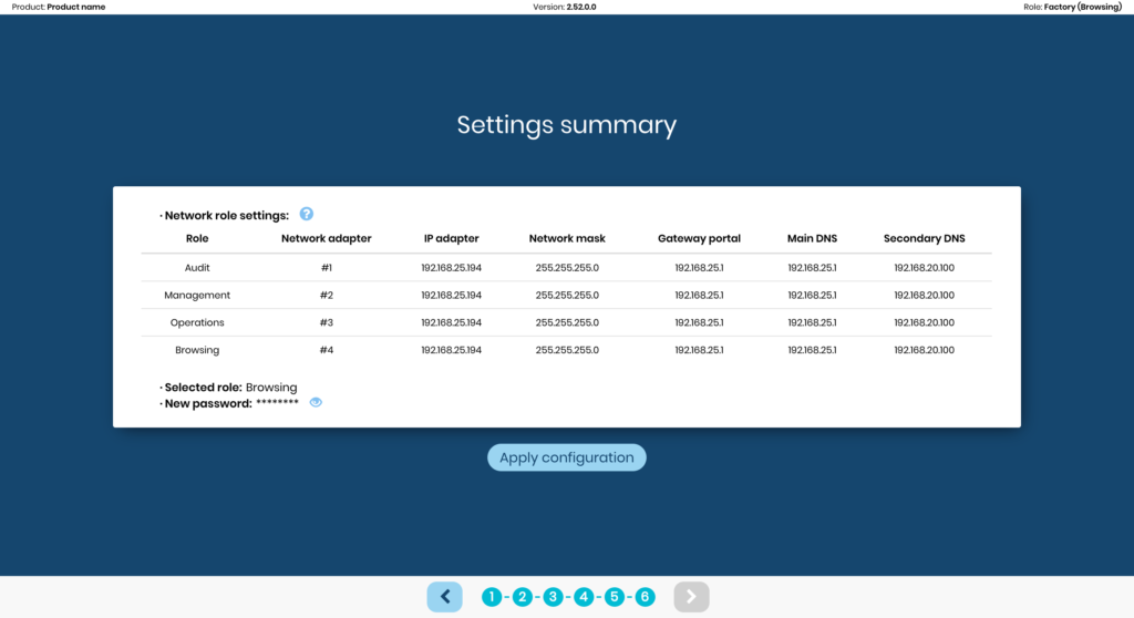
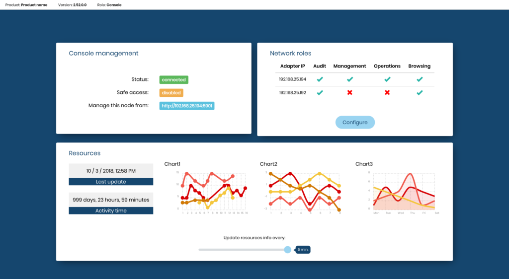
After several user tests and surveys, we got important insights that led us to make some important decisions. Our surveys revealed that, in more than 80% of the cases, administrators would remain in front of this software for at least 5 hours a day. That’s why we decided to add the light and dark themes to the project in order to adapt it to the different preferences of each user. The colors’ contrast needed to be adequate in both themes. All screens are as simple and understandable as possible, even those containing a large amount of information. Contextual tools (tooltips) were added to improve the understanding of some of the settings that the user tests revealed to be more complex.
02. Wireframes Lo-Fi (Software Installer & Admin Dashboard)
Wireframes served as a perfect example of the user’s interface refinement after several iterations.
03. Wireframes Mid-Fi (Software Installer & Admin Dashboard)
Some early design guidelines I designed to make it easier for the client and stakeholders to understand the screens and their iterative process.
04. User Dashboard (Hi-Fi)
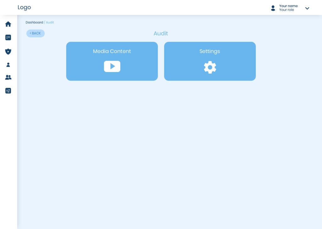
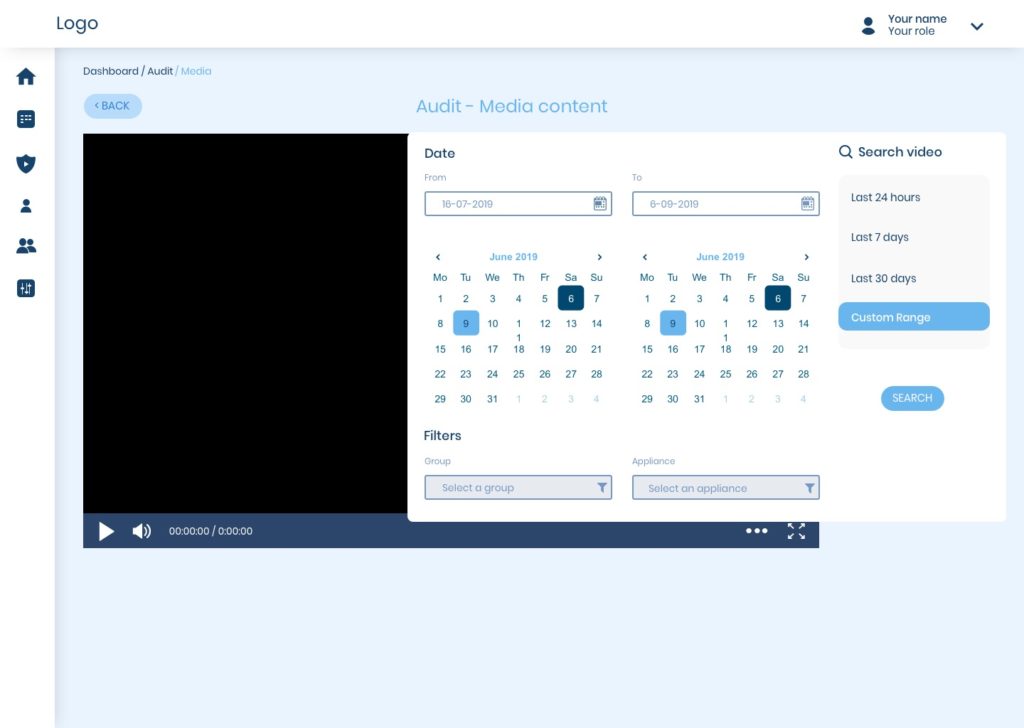
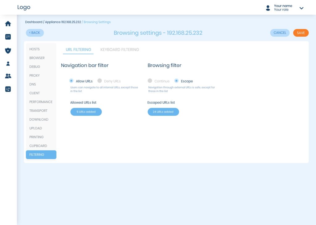
This is the end-user dashboard. It is the control interface provided to the end customer to manage the product. Below are some screens I designed to configure the security software.
05. User Dashboard Testing – Axure Mockup Iterations
This prototype was designed and tested to improve some particularly complex sections of the software. After showing and explaining this prototype to stakeholders, some key sections were regrouped using the card-sorting technique.
06. UI Kit + Iconography
Brief sample of elements from the UI Kit I designed for the company:
07. User Testing
Below you can read a list of the user feedback we received during the testing phase. I worked closely with the QA team to test and improve the final product.
- Restore connection window – give more information and not just show your attempts.
- Smooth scrolling (improve inertia).
- The keyboard covers the fields you will type in, at least on the first attempt.
- Incompatibility message out of context.
- Unclear typography in some titles and icons.
- Using the back button, the system sometimes drops.
- Double-tap and drag-and-drop zoom does not work (although not all apps allow it).
- Context menu flashes at times.
- Help messages. Unclear or descriptive in some cases.
- Check the wording of the help messages (unify them).
08. Alternative Wireframes
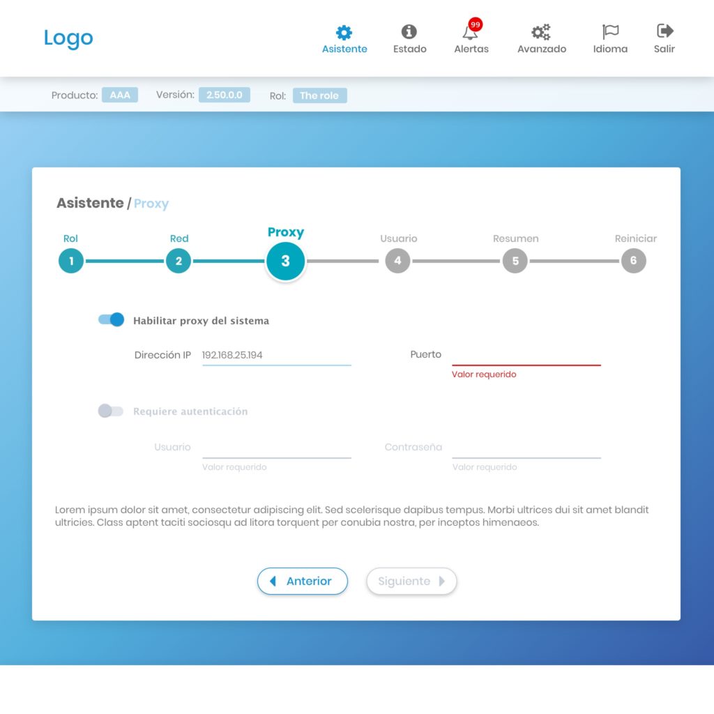
Finally, I’m showing an alternative design version I did during this project.


